
Need a New College or University Logo? Here’s Why Font Matters
Is your institution’s logo or identity system ready for a makeover? One of our biggest pieces of advice for colleges and universities throughout this process is this:
Be intentional about the font you select.
Take it from the perspective of a brilliant creative who has dedicated her career to type design: Sibylle Hagmann.
CCA came across Sibylle’s work and her creative studio Kontour while we were developing a new branding system for Moore College of Art & Design in 2020. We ultimately chose Utile, a font she created, as described here on Fonts In Use:
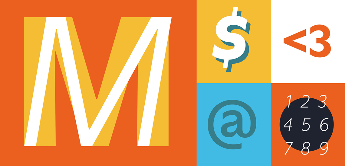
“Utile is an elegant and subtly flared sans serif, suited for continuous smaller sized text and impactful display typography with superb legibility and optical balance in print and screen. With the rebranding efforts, it contributes beautifully and dynamically to the Moore College of Art & Design’s new and contemporary branding.”
Our creative director David A. Moore says it was important to choose a font that reflected the mission of the college itself. Moore is the nation’s first and only historically women’s college of art and design. They not only help their students to be amazing artists, but they prepare them to have amazing careers.
As Sibylle is a successful businesswoman in a creative field, he adds, our font choice had greater resonance and meaning. Utile isn’t just attractive packaging laid on top of the institution. It’s a potent embodiment and example of the living brand itself.
Clearly, we deeply respect Sibylle’s work, thoughtfulness, and background in the industry. So we asked her to give you her thoughts on fonts. Take a look.
On the importance of typography:
“Corporations invest in a professional image representation for a number of reasons, among them to have a cohesive appearance, to make a lasting impression, to build trustworthiness and equity, and to create a unique and continuing enterprise awareness. One of the most important brand assets of corporate appearance is the selection of typefaces.
Minute details of letter shapes help evoke a certain connotation. Think of it as a flavor to lend the communication an intentional tone of voice. For example, serifs (or lack thereof), a small extension attached off the stem of a letter are implying a certain association of formal classic style, while a serif-less type may insinuate approachability and a contemporary feel.
Typography is often considered a small part since it is entirely second nature to how humans learn, communicate, do business, etc. However, in any given document, a large part of information presented typically assumes the form of text. Many designs are characterized by consisting predominantly of collections of individual fonts, ‘speaking’ a finely calibrated language, communicating a stable brand experience.”
On her ideal process:
“Branding teams carefully research and develop a strategy to find the exact right tone representing a corporate personality. This is best left to trained individuals who have a thorough understanding of typography and typographic choices. The decision-making of defining a typographic palette rests on understanding a client’s typographic needs, media requirements, and desired tone of voice.
A typeface’s fame, popularity, or easy reach may not always be the best choice. A brand’s positioning is greatly supported by selecting quality type that lasts and that helps to reinforce a distinct typographic identity.”
On digital typefaces:
“Digital typefaces, developed over years and undergoing rigorous testing of form, spacing, and kerning, are software that are paid for use via licenses.
As such, it is a quality visual digital tool that I like to draw parallels to a lounge chair that is timeless, fits into various environments, possesses flawless proportions, and provides superior comfort for relaxation. Following this analogy: Choose a type that passes the test of time, fulfills typographic tasks as expected or above, and possesses details and proportions that contribute to excellent readability distinct from the kind of media.”
More about Sibylle & her company:
Sibylle founded Kontour in 2000. A Swiss-born American, her design experience spans more than 35 years with an undergraduate degree from The Basel School of Design—a curriculum built on the classic Bauhaus program in the shadow of Swiss International Style—and a graduate degree from the California Institute of the Arts in Valencia, California, at the opposite stylistic end, merging the best of both worlds.
She is currently a professor at the University of Houston since 2002, and a few months after her Utile font was chosen for Moore College of Art & Design, she received the honorary degree of Doctor of Fine Arts from Moore. A full-circle achievement.
She’s also incredibly great to work with. Thank you, Sibylle!
In the meantime, get a closer look at the Moore logo in the explainer video below.
Fun fact: The uppercase R is what initially caught our eye. When designing a wordmark, David says, you need to pay particular attention to the individual letterforms you’ll be using, and that R feels special and unique. Then when we saw the power, subtlety, and versatility of the entire family of fonts—it sealed the deal.